Design Decisions for a New Search Results Page
One of my specialties as a freelance consultant is discovery systems for e-commerce -- web pages and backend systems for helping users search for and find what they want or need. For the last year and a half, I've been working as a consultant for DesignShop, a company that sells materials samples for home renovations. Want to find a countertop, cabinet, paint, and tile combo for your kitchen reno that looks great, with samples shipped overnight? Check 'em out.
Much of my work at DesignShop has been on ranking and relevance -- finding ways to improve which items appear when you enter a search or apply a filter, and the order in which they're shown. Recently, I got to work on a revamp of the visual design and user experience of the Search Results Page (SERP) -- everything except ranking and relevance! In collaboration with colleagues in design, engineering, and others, we created a simple and straightforward search experience that, we believe, guides users towards good discovery paths. Let me walk you through some key details, some of which are a little unusual, and explain how we got to this design.
We had a few constraints. Keep it very simple -- this design was replacing an overly complex search drop-down that was no longer relevant or useful. Help users do the things that will get them a great list of samples to browse efficiently, on both mobile and desktop devices. And minimize future maintenance costs as well as expensive search engine queries.
This is what the SERP looks like as of this writing:
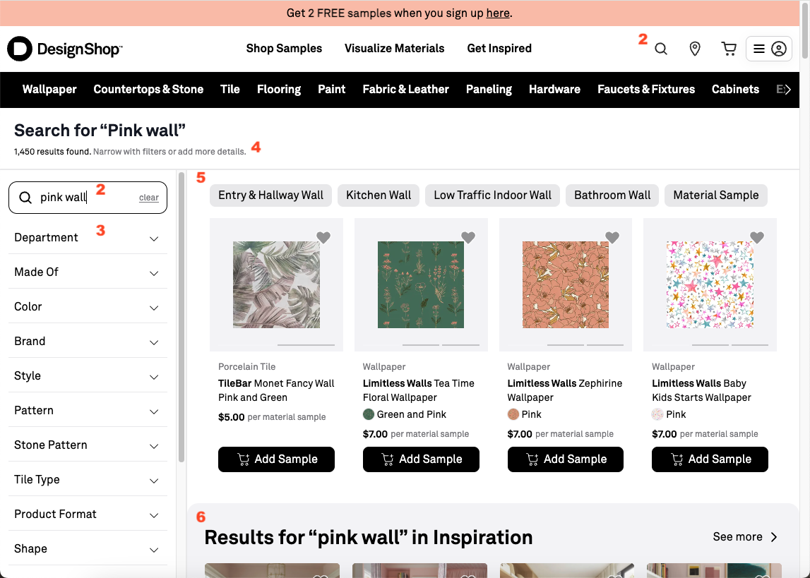
DesignShop search results page, showing numbered features discussed in text.
Decisions
Let's go through some of the decisions and design elements.
Get users to the SERP, then refine there
- Simple search bar in the header. When you click on the header search bar, you see just recent search history and popular item suggestions before you start typing, and autocomplete after you start typing. No search-as-you-type -- previous iteration was visually busy and difficult to refine effectively. The value of showing a few examples when just a few letters have been typed is not high, and there's limited screen pixels to show results, so we made the tradeoff to keep it simple. We want people to type something and press Enter, to get to the SERP, which is where refinement is easiest.
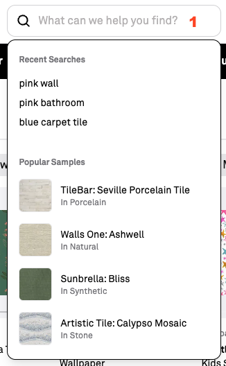
Search bar in the header with no input -- just recent history and some popular samples.
Note that not every e-commerce site should make this decision. I really like this recent teardown of the HOKA sneakers website. Their comparatively small catalog makes complex drop-downs potentially helpful for users, showing just a few results without a full page load.
- Move attention from the header search box to the search results and refinement. We want users to refine their query when results are too broad or off-target. So we placed the editable search box next to the results to make that relationship explicit. On the SERP, we reduced the site-wide header search box to just an icon. We think this signals "start over" rather than "refine this result set." Many SERP designs keep the editable box in the header, but for DesignShop, with a substantial site-wide header that includes category page and special features links, this pattern is clearer.
Make filter applications obvious and cheap
- Keep filters visible on desktop, easily accessible on mobile. The filter accordion is always visible on desktop,
on the left of the search results, and is easily accessible on mobile. We want people to filter, because structured filters usually outperform raw keyword matching on multi-word queries (
color:pink category:tileoften yields better results than doespink tile). DesignShop does do some automatic filtering and reranking, but coverage is imperfect.
Keeping filter categories visible also teaches users what the catalog contains, critical with tens of thousands of items, in dozens of brands and categories, where the point of the site is to purchase samples from multiple categories to validate that they'll go well together. The tradeoff to keeping the filters visible is fewer pixels to showcase results, but on desktop this is still the right balance.
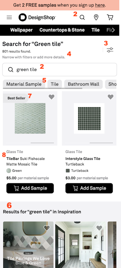
Search results on mobile.
-
Tell users exactly what to do: refine the query. Scrolling helps users sample variety, but with thousands of results it is rarely the fastest path to a good choice. We explicitly prompt refinement so users lean on categories and item properties instead of endless browsing.
-
Use Post-Query Refinement Suggestions (PQRS). As I previously described here, these are high-value filter buttons elevated from the sidebar when an algorithm suggests that they will most effectively narrow large result sets.
Make the results grid legible, informative, and trustworthy
-
Secondary results are distinct but inline. An early version of the SERP interleaved curated Collections with sample results in a way that made evaluation and visual scanning difficult for users. The current version still shows both, but visually demarcates Collections results so users can, if they want, focus on them without confusing them with primary product matches.
-
Show merchandising tags to explain value. Labels like "Best Seller" provide proof-of-value cues and help users understand that ranking reflects meaningful signals.
-
Diversify brands in the top row. Just as we draw attention to filters to educate users about what's available, we sometimes use search ranking to highlight the diversity of product brands on the site. DesignShop lightly reorders the first few items so users are more likely to see multiple brands early in their review of the results.
There's always more to do: results to measure, tradeoffs to balance, tweaks to fix, and new hypotheses once the metrics and real user feedback arrive. A search design never really finishes -- it becomes the baseline for the next set of opportunities to help the user. Even so, what shipped already feels like progress: a simple path from the header into the SERP, refinement sitting next to the result set instead of competing with it, and a grid that keep the results legible to searchers. I think that's a solid step forward.
Notes:
- This post is my personal take on the redesign, and shouldn't be read as an official DesignShop document.
- As a technical aside, with this re-write, we observed that Algolia's InstantSearch library has reduced value now, in the age of AI assisted engineering. It's just so fast to write code, if the requirements are clear, that the library adds opaque layers compared with calling the API directly and updating the page. We ended up stripping it out of the SERP (although it's still used elsewhere on the site).
- This post was human-authored with AI used for feedback and light editing. Of course, most of the software implementation was done by AI agents, supported by human engineers.