Communicating A/B Test Results for Conversion Rates with Ratios and Uncertainty Intervals
A/B testing is a tool for supporting decision-making in business, and so in addition to getting the statistics right, it’s really important to communicate well with the non-statisticians who will have the final say on the go/no-go decision. Most A/B tests in practice are testing ratios, conversion rates of various sorts – say, the proportion of people who visit your web site who buy at least one pair of shoes. Although the underlying data is just four numbers (visitors and purchasers, from the control group and the test group), there are lots of ways to compute statistics and present those numbers. Not all of those ways are ideal for supporting communication.
In this post, I’m going to walk through my favorite way of presenting A/B test results for conversion rates – as ratios, with uncertainty intervals around those ratios. For instance, you might be able to say something like “this test very likely increased the conversion rate by somewhere between +0.6% and +4.8%, perhaps around +3%.” (That would be a really good result for almost any change on any web site, by the way!) Business people think in percents, all day, every day – almost every KPI is presented as quarterly or annual growth. So presenting this way means you’re speaking their language and will get their attention.
But, that’s not how most web sites and A/B testing tools present the numbers. Suppose you had 100,000 visitors to your A and B variants of your site, 15,000 of them converted in the A (control) variant (15%), and 15,400 converted in the B (test) variant. Let’s look at how some of those tools might present those results.
At AB Testguide, a web calculator you might get when you type “A/B test calculator” into a web search engine, you get the 2.7% relative ratio (\(\frac{15400-15000}{15000}\)), but everything else is (in my view) a confusing mess:
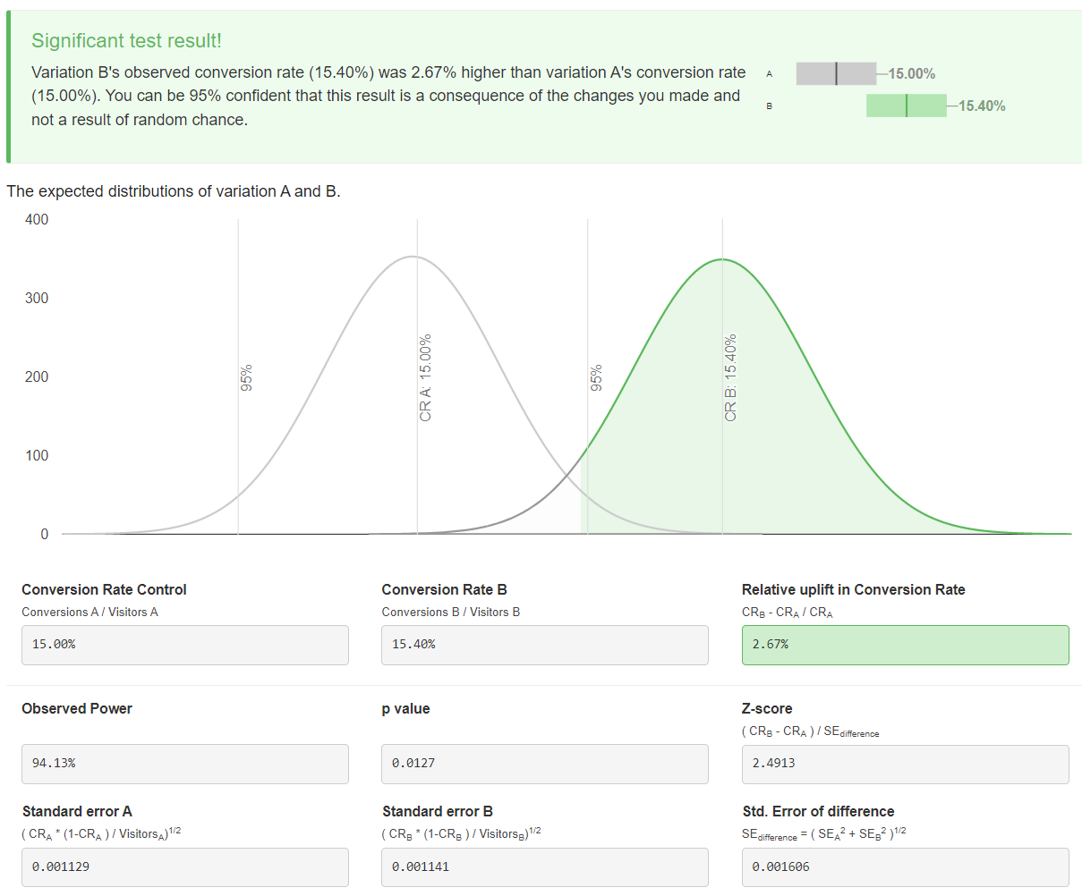
Figure 1: Results from AB Testguide web site.
- The bottom-line box up top is nice, but it shows unlabeled uncertainty intervals, so you can’t really tell how uncertain each conversion rate is. (As an aside, I often follow Gelman’s advice to use “uncertainty” instead of “confidence”, but it’s the same thing.)
- Those normal curves are hard to read and take up a ton of space. They’re supposed to communicate that each measurement has uncertainty, and that there’s not much overlap, but it’s unclear what “not much” means, or how you’re supposed to use the graph to make a decision.
- The boxes below show the steps in the standard frequentist computation of the \(p\)-value for the ratio test, which is what the app is doing. That’s fine, I guess, but none of these numbers help you much with communication. And if you’re using an app like this, and not, say, the tools built in to R or Python, you’re probably not a statistician, so this is a little bit of blinding you with science.
Speaking of R, let’s look at how its built-in prop.test function
presents the results. This is a standard tool for statisticians. It’s one
line of code from a standard library:
prop.test(c(15400, 15000), c(100000, 100000))##
## 2-sample test for equality of proportions with continuity correction
##
## data: c(15400, 15000) out of c(1e+05, 1e+05)
## X-squared = 6.1756, df = 1, p-value = 0.01295
## alternative hypothesis: two.sided
## 95 percent confidence interval:
## 0.0008431498 0.0071568502
## sample estimates:
## prop 1 prop 2
## 0.154 0.150This output gives you what you’d need to format your results for an academic paper. You might say: “The test increased the conversion rate significantly (\(\Chi^2(1)=6.18, p=0.01\)).” That’s not really going to help you talk to a product manager. It does give a confidence interval of [0.0008 to 0.0071], but that’s for the absolute difference of the proportions of 0.004, not the relative change. Again, you’re better off if you can consistently communicate using relative measures.
What about commercial products? Lots of tech companies use Optimizely, which has nice tools for running A/B tests from either the front-end, where marketers can change the UI without software engineers, or the back-end, where engineers can run robust tests that aren’t invalidated by ad-blockers. But I don’t love their presentation of results, such as for this A/B/C (two tests vs. one control) test from their documentation:
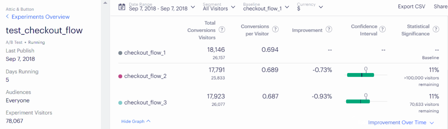
Figure 2: Example of Optimizely’s user interface on test results.
- They do a nice job of showing the number of visitors, the conversion rate, and the relative improvement (in this case, negative).
- But they show a difficult-to-interpret unlabeled confidence interval which just says whether the interval includes 0 (no change) or not.
- And they use an unusual presentation of \(1-p\) for statistical significance. This is likely to draw non-statisticians to misinterpret this value as “the likelihood that the improvement number (e.g., -0.73%) is correct.” The correct meaning is more like “the likelihood that a re-run of this experiment would not show an effect of this size or larger, if the true effect size is exactly 0.” So it’s not supporting effective or correct statistical communication.
So what might be better? I think that focusing on the relative ratio (as that web site and Optimizely do) is a good idea, but we should lean into uncertainty intervals more. In particular, instead of trying to show uncertainty intervals on both of the raw measurements (as the web site does), we should compute uncertainty intervals on the ratio, and focus on that interval even more than the point estimate of the ratio.
For the toy example from above, I’d recommend saying something like: “the improvement is very likely between 0.6% and 4.8%, with a point estimate around 3%.” If you wanted, you could draw a little graph of this, and I’ll show you a decent way to do that below, but really, the three numbers are enough.
But where did those numbers come from? As it turns out, the ratio of two proportions (each of which is an observation from an underlying binomial distribution) has an easy-to-compute distribution. The R code below computes the 95th percentile range of that distribution, representing the uncertainty interval. (The “very likely” above is a bit of hand-waving to communicate this to a non-statistician. More on that below.)
cr_ratio <- function(a_ct, b_ct, a_conv, b_conv,
                     percentiles=c(0.025, .5, 0.975),
                     as_percents = TRUE) {
  a_prop = a_conv / a_ct
  b_prop = b_conv / b_ct
  m = log(b_prop / a_prop)
  v = ((1 / a_prop) - 1) / a_ct + ((1 / b_prop) - 1) / b_ct
  ret = exp(qnorm(percentiles, mean=m, sd=sqrt(v)))
  if (as_percents) ret <- 100 * (ret - 1)
  names(ret) = percentiles * 100
  ret
}

cr_ratio(100000, 100000, 15000, 15400)
## 2.5 50 97.5
## 0.5627688 2.6666667 4.8145807Removing insignificant digits and rounding appropriately, this yields the 0.6% to 4.8% range and the point estimate.
You can, with a bit of effort, create visualizations that get at the most important things to communicate: the uncertainty interval, and the “no impact” baseline:
df <- as_tibble(t(cr_ratio(100000, 100000, 15000, 15400, as_percents=FALSE)))
names(df) <- c('min', 'pt', 'max')
df$x <- 1
labels <- tribble(
  ~x, ~y, ~txt,
  "purchase rate", df$min, scales::percent(df$min-1, .1),
  "purchase rate", df$max, scales::percent(df$max-1, .1)
)
ggplot(df, aes(x, ymin=min, y=pt, ymax=max)) +
  geom_crossbar(width=.2) +
  geom_text(data=labels, mapping=aes(x=x, y=y, ymin=NULL, ymax=NULL, label=txt),
            nudge_x=.2) +
  geom_hline(yintercept=1, color='blue') +
  scale_x_discrete("") +
  scale_y_continuous("B/A Ratio", labels=scales::percent, limits=c(.92, 1.08)) +
  coord_flip() +
  theme_minimal()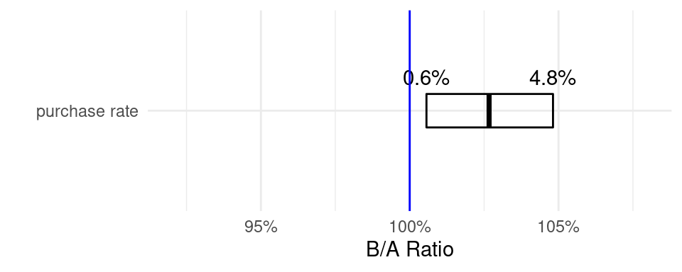
This display is handy to standardize, as you can show multiple different conversion rates on the same graph, giving clear context to the results of the experiment.
Before certain statisticians in the audience write angry comments, I’m well aware that interpreting frequentist intervals correctly requires some hair-splitting language, and that Bayesian credible intervals are more directly tied to peoples’ intuitions. As it turns out, though, in practice at the scale that most web A/B tests run, there’s no practical difference. You can interpret frequentist intervals such as the above as if they were Bayesian, and describe them the “wrong way”, as if they were saying something about the beliefs you should have about the true values. Here’s an illustration, generating the Bayesian credible interval on the posterior distribution:
#plotBeta(15,85) # we think CR is around 15%
AB1 <- bayesAB::bayesTest(
                 c(rep.int(1, 15400), rep.int(0, 100000-15400)),
                 c(rep.int(1, 15000), rep.int(0, 100000-15000)),
                 priors = c('alpha' = 15, 'beta' = 85),
                 n_samples = 1e5, distribution = 'bernoulli')
round(summary(AB1,
              credInt=rep(0.95, length(AB1$posteriors)))$interval$Probability * 100,
      3)
## 2.5% 97.5%
## 0.562 4.820Because the number of observations is high, and our prior is relatively broad, this is essentially the same interval as we computed above. So we’re justified in the hand-waving that makes communications with business people much, much clearer. We can defensibly say, if pressed, that “very likely” is equivalent to “a range covering 95% of the credible values of the true ratio.” Plus, the closed-form frequentist approach is much, much faster than the numerical simulation required to compute the Bayesian intervals.
To sum up:
- For A/B tests in industry, you should speak business language, and talk about the relative improvement from the changes you’re testing.
- But, you need to be honest about your uncertainty. Lead with the uncertainty interval, and mention the point estimate only secondarily.
- Use the closed-form computation above to compute the uncertainty interval. Even though Bayesian computation is better in principle, it won’t help you help your organization make better decisions, it requires more work on your end, and it’s likely to confuse people.
If you end up using this approach to communicating A/B test results, I’d love to hear about your experiences! For me, I’ve found that consistently communicating this way led to easy conversations and fast decision-making.