intuitive visualizations of categorization for non-technical audiences
I’m generally interested in finding better ways to build clean, intuitive, and informative visualizations of data, especially when the visualizations can leverage intuitions and skills that everyone has. For example, almost everyone has a surprisingly good approximate number sense, the ability to quickly identify about how many items are in a largish group. For example, if shown a photo of 30 oranges and a photo of 20 oranges, you would be able to immediately say that there were more oranges in the first photo, and you would happily say that that photo had a few dozen oranges in it. This psychological skill can be used to make more effective visualizations of certain types of data. Instead of comparing two quantities by lines in a chart, or even a number in a table, it may be useful to compare visual density.
How can this be used to make better visualizations of prediction quality? Consider the standard ways that predictive model quality is reported. I have obfuscated the test set data from the problem I mentioned above, and placed it in a public Dropbox in Rdata format. I’ve also put together an R script to demonstrate various ways of looking at the predictions and put it in a Github gist. Follow along if you’d like.
First, take a look at the data frame and some summary statistics:
> head(pred.df)
      predicted actual actual.bin
7379  0.6020833    yes          1
5357  0.5791667    yes          1
7894  0.5791667    yes          1
5893  0.5604167    yes          1
16093 0.5541667    yes          1
2883  0.5520833    yes          1

> summary(pred.df)
   predicted        actual       actual.bin
 Min.   :0.000000   no :7785   Min.   :0.0000
 1st Qu.:0.004167   yes: 366   1st Qu.:0.0000
 Median :0.016667              Median :0.0000
 Mean   :0.040827              Mean   :0.0449
 3rd Qu.:0.041667              3rd Qu.:0.0000
 Max.   :0.602083              Max.   :1.0000
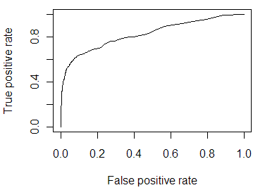
The mode predicts about 4% of the items will be in the “yes” category, which is similar to the 4.5% that actually were. Using the very flexible ROCR package, I can quickly and easily convert this data frame into an object that can then be used to calculate any number of standard measures of predictiveness. First, I calculate the AUC value, which has a very intuitive interpretation. Consider sorting the list of items from most-predicted-to-be-“yes” to least. If the predictions are good, most of the “yes” values will be relatively high in the list. The AUC is equivalent to asking, if I randomly pick a “yes” item and a “no” item out of the list, how likely is the “yes” item to be higher on the list? If the list was randomly shuffled, it would 0.5; if it were perfectly shuffled with 20/20 hindsight, the AUC would be 1.0.
> # convert to their object type (labels should be some sort of ordered type)
> pred.rocr <- prediction(pred.df$predicted, pred.df$actual)
> # Area Under the ROC Curve
> performance(pred.rocr, 'auc')@y.values[[1]]
[1] 0.8237496
In this case, it’s about .82, which is probably valuable but far from perfect. Another common way of looking at this type of predictions comes from business uses, where the goal is to identify leads (or whatever) that are likely to convert to purchases. From this point of view, the goal is to lift the leads higher in the list, so that you can focus on the top of the list and got more benefit from sales effort with less work. Two common ways of looking at lift are with a decile table, which shows how much value you get by focusing on the top 10%, 20%, etc. of the list, sorted by the predictive model, and the lift chart, which visualizes the same thing by showing how much benefit over random guessing you get by looking at more or less of the sorted list. Here they are for this data:
# decile table
dec.table <- ldply((1:10)/10, function(x) data.frame(
    decile=x,
    prop.yes=sum(pred.df$actual.bin[1:ceiling(nrow(pred.df)*x)])/sum(pred.df$actual.bin),
    lift=mean(pred.df$actual.bin[1:ceiling(nrow(pred.df)*x)])/mean(pred.df$actual.bin)))
print(dec.table, digits=2)

   decile prop.yes lift
1     0.1     0.61  6.1
2     0.2     0.69  3.4
3     0.3     0.76  2.5
4     0.4     0.80  2.0
5     0.5     0.84  1.7
6     0.6     0.90  1.5
7     0.7     0.92  1.3
8     0.8     0.95  1.2
9     0.9     0.99  1.1
10    1.0     1.00  1.0

# Lift Curve
plot(performance(pred.rocr, 'lift', 'rpp'))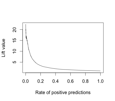
This graph shows, not particularly intuitively in my view, that if you focus on the top 10% of the data, you get more 5 times the bang for the buck than if you focus evenly on the whole set of items. The decile table shows the same thing – the top decile is lifted by a factor 0f 6.1, and in fact you get 61% of the “yes” items in that top 10% of the data. These are very useful numbers to know, but I think there are considerably more intuitive ways of showing how the predictive model pulls the “yes” values away from the 5% base rate.
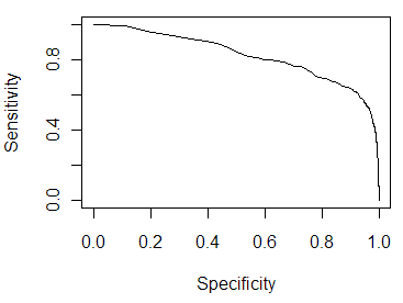
These more intuitive ways are not the standard graphs used in statistics and machine learning, such as the sensitivity/specificity curve and the ROC curve. Those graphs, shown below, illustrate trade-offs between accepting false positives and false negatives. Useful, yes, but to understand them you have to think about the ways you could set a threshold and what effect that threshold would have on the nature of your predictions. That’s not particularly intuitive, and the visualization doesn’t visually contrast two things, so it’s difficult to get an intuitive understanding of what has been gained.
I’ve put some thought and some tinkering into potentially better ways of visualizing the output of predictive models. The key, I think, is to use a visualization that builds on the scatter graph. Scatter graphs are great for less-technical audiences, because you can tell them that every individual dot is a customer (widget, whatever). They can immediately see the number of items in question, and if you can plot the points on axes that make sense to them, they can go from “that dot there represents one person with this level of X and this level of Y”, to “this set of dots represents a set of people with similar levels of X and Y”, to “this graph represents everyone, and their respective levels of X and Y.” And because of skills like the approximate number sense and the ability to quickly understand visual density, scatter graphs can give a vastly better understanding of the range of a data set than summary graphs that just plot a line and maybe some error bars.
Here are several versions of a graph that illustrates how the predictive model smears out the set of dots from the 5% base rate, disproportionately pulling the “yes” items to the right, separating at least some of them from the much larger set of “no” items. One key change from a basic scatter graph is to jitter the Y position of each point randomly, which I think makes these graphs look a little like a PCR gel image.
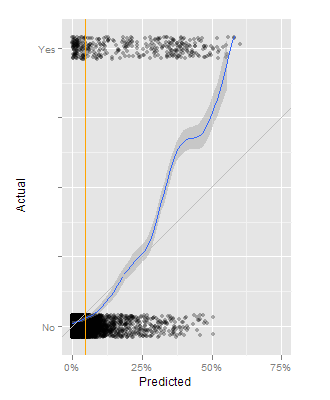
This first approach is built around a basic scatter graph, where the X axis is the predicted likelihood of being a “yes”, and the Y axis is 0 for actual “no” and 1 for actual “yes” items. On top of that is an orange line representing the base rate of about 5%, a blue line showing the smoothed ratio between “yes” and “no” items at each level of prediction, and a thin grey line showing where the blue line ought to be. In this case, the model tends to underestimate the likelihood that some items are to be “yes” items. At 50%, half of the items should be “yes” and half should be “no”, but it’s more like 3:1.
I like this graph as it intuitively lets people see the extent to which the predictive model is separating the categories, and how much better it does than just assuming the base rate. My second approach at this combines the “smears” with another way of visualizing lift.
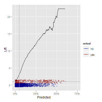
In this graph, the smeared real data is at the bottom of the graph, and the black line represents the lift, or how much better you are at identifying “yes” items by using the predictions. It’s also an intuitive way of motivating the need to draw a boundary to focus effort. When trying to convert the points at the 25% level or above, you may be ineffective 75% of the time, but you’re also more than 10 times more efficient than you would be otherwise.
My final attempt worth sharing is this one, which combines the dual smear approach with the cumulative value numbers from the lift table.

Now, in addition to being able to see the density of yes and no items for various levels of the prediction, you can see what proportion of the potential “yes” values exist to the right of each level of the prediction. For example, at a threshold of 25%, you capture 40 or 45% of the “yes” items. At a 5% threshold you capture more than 70% of the “yes” items.
I’d love some feedback on these graphs! Do you agree with my assertion that scatter graphs are more visually intuitive and easier to motivate to non-technical audiences? Do these variations on lift charts seem clearer or more valuable than traditional alternatives to you? Have I re-invented something that should be cited?
The R code for these graphs is available in the Github gist. I used ggplot2, naturally, which is an essential tool for exploring the space of possible visualizations without being tied down by traditional graph structures.
Incidentally, for people interested in building graphs that leverage people’s innate visual capabilities, I recommend Kosslyn’s book, Graph Design for the Eye and Mind.
Also incidentally, the question of how to communicate or visualize the potentially incredibly complex sets of rules/weights/whatever inside the categorization black box is another fascinating issue, the subject of ongoing research, and maybe something I’ll write about soon.